









The things that look permanent are usually the ones getting worked on hardest. You just don’t see the scaffolding until it comes down.
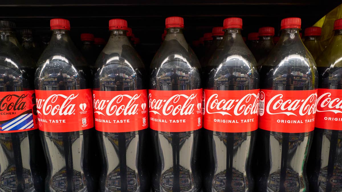
Think about the objects that haven’t changed in your lifetime. The stop sign. The three-pronged plug. The red can sitting in a cooler at a gas station in a country whose language you can’t read.
You can identify that can from across the room without processing a single word on it. That isn’t luck. It’s 140 years of deliberate repetition, and it’s worth more to the company that owns it than most of the plants that fill the cans.
Coca-Cola (KO) products account for roughly 2.2 billion of an estimated 65 billion beverage servings consumed worldwide each day, according to the company’s 2025 Form 10-K. Recognition does most of the selling. The formula is almost beside the point.
So when a company sitting on an asset like that decides to redraw it, the interesting question isn’t what changed. It’s who was the change built for?
Coca-Cola unveiled a new global visual identity this month, rolling out across more than 200 markets. The audience for it is not the person standing at the cooler.
What Coca-Cola actually changed about its look
There’s no new logo. The Spencerian script, the Dynamic Ribbon and that specific red are all still there, just drawn louder.
The work was led by Jones Knowles Ritchie, which sharpened the red and white palette, the Dynamic Ribbon, the Arden Square and the script so each element reads harder across every consumer touchpoint, according to Creative Bloq. Being one of the world’s most recognized brands carries “a responsibility to keep evolving,” said Arnab Roy, president of Coca-Cola’s global category unit, in comments published by the same outlet.
More Retail:
- Costco makes a silent gas change that members will love
- PepsiCo CEO maintains full-year guidance amid higher gas prices
- Domino’s value deals reveal shift in pizza lovers behavior
The bigger piece sits behind the artwork. Coca-Cola also launched an immersive Brand Center and a Design Intelligence tool that together function as a universal design system for internal teams and agency partners, delivering “greater consistency at a global scale,” according to PRINT Magazine.
The partner list is long. A packaging system built with The SUPERULTRARARE, a proprietary typeface with Brody Associates, photography standards with three named photographers, the Brand Center with Forpeople and Monks, and governance tools with Adobe (ADBE), per the same report.
Why the design system matters more than the artwork
Read that partner list again and one name breaks the pattern. Adobe isn’t a design shop. It’s the software layer, and its presence points at the part of this announcement that has nothing to do with how the can looks.
In May 2025, Coca-Cola introduced Project Fizzion with Adobe, a design intelligence system that converts brand guidelines into “intelligent, adaptive assets” and was pitched as helping teams produce content up to ten times faster, according to The Coca-Cola Company. It was a pilot at the time.
Related: Coca-Cola launches exclusive soda flavor at fast-food giant
That pilot is now shipping as Design Intelligence, bundled into the global identity rollout. What struck me reading the two announcements side by side is that the July refresh is the packaging around a machine-readable brand, not a design exercise that happened to include some software.
Fizzion encodes designer decisions into what Coca-Cola calls a StyleID, a machine-readable identity that applies brand rules automatically across formats and markets. Redrawing the ribbon so it renders cleanly at every size is what makes that possible.
How Coca-Cola got here
- 1969: The Dynamic Ribbon is introduced to unify the brand’s core design elements, according to Logo Archive.
- 2021: The company launches its Real Magic platform with a refreshed visual identity, its first new global brand platform for the trademark in five years, according to The Coca-Cola Company.
- May 2025: Project Fizzion enters pilot with Adobe, encoding creative intent into a machine-readable StyleID, according to The Coca-Cola Company.
- July 2026: The new identity, Brand Center and Design Intelligence roll out across more than 200 markets, according to PRINT Magazine.
What the refresh means for KO stock and its dividend
I ran Coca-Cola’s advertising line against its revenue line, and the ratio is the tell.
Advertising expenses were $5.4 billion in 2025 versus $5.1 billion in 2024, while net operating revenues rose 2% to $47.9 billion, according to the 10-K. Advertising climbed close to 6% against revenue growth of 2%.
Marketing is getting expensive faster than the business is getting bigger. A design system that lets 200 markets generate localized work without commissioning a fresh brief each time is a direct answer to that gap.
If you hold KO in a dividend portfolio or through an S&P 500 fund, this is closer to you than it sounds. The payout ratio sits near 80%, according to Yahoo Finance. Money that never gets spent on production is money that never has to compete with your dividend.
That’s the unglamorous version of what a rebrand is. It’s a cost structure wearing a nicer outfit.
What to watch when Coca-Cola reports on July 28
The company releases second-quarter results before the New York Stock Exchange opens on July 28, according to Business Wire.
Analysts expect earnings per share near 92 cents on revenue of roughly $13.1 billion, and Jefferies anticipates management will reiterate full-year guidance of 4% to 5% organic sales growth and 8% to 9% earnings per share growth, according to Proactive Investors.
Nobody buys a Coke because the ribbon got bolder. But the timing of this, eight days before earnings and roughly fourteen months into an AI tooling project, says Coca-Cola is trying to make its most valuable asset legible to software before its competitors do.
The can in the cooler will look almost exactly the same. The machine that produced it won’t.
Watch the selling, general and administrative expenses line on July 28. If the design system works the way it was built to work, that’s where it shows up first, long before you notice anything different on a shelf.
Related: Coca-Cola looks set to bring back new take on giant failure